Shopping note: This journal carries advertisements and may earn a commission from qualifying purchases through marked commercial links. Product availability, prices and returns depend on your retailer and region. Read our disclosure.
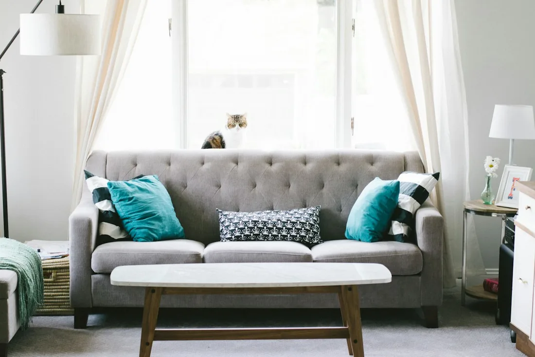
An accent colour can repeat through a room without every object needing to match it. Notice where the colour already appears before deciding to add more. A cushion, a small picture detail and another object may create a visible connection, while repeating the colour everywhere can change the room’s balance entirely. Compare the arrangement you have with a smaller or different existing selection to understand which relationship you actually prefer.
Identify the existing repetitions
Look around the actual room and name the places where the colour appears. Keep the list descriptive rather than forcing slightly different shades into a single exact label. A turquoise cushion and a blue-green image detail can relate without being identical.
Notice the size of each coloured area. A large fabric surface has a different visual role from a tiny mark in a picture. Counting three objects does not tell you how much emphasis the colour receives in the whole room.
Find the strongest occurrence
Choose the element that currently makes the colour most apparent. Ask whether you like it as the main emphasis or want a quieter relationship. That decision gives the rest of the comparison a direction instead of allowing every attractive small object to become another accent by default.
Do not move installed objects or alter furnishings to make a quick experiment. Work within appropriate handling and use of what you own. A simple visual review or a permitted change among loose decorative objects may be enough to understand the relationship.
Compare an edited arrangement
Where appropriate, compare the present selection with fewer visible repetitions. Look at the whole room again rather than only the area you changed. You may find that one strong occurrence carries the colour clearly, or that a small repetition elsewhere helps the room feel more connected.
The framed print layout guide provides another example of considering relationships before making a physical change. Keep a visual idea separate from the practical requirements of any later display or installation.
Resist the automatic shopping step
If the comparison suggests you want a different relationship, first describe it in words. Perhaps the colour needs less prominence near the sofa or a quieter surrounding group. That does not automatically mean you need another object in the same shade. An existing arrangement may simply need to remain as it is.
The chair fabric sample guide shows why a proposed colour should be considered in the actual room context. A small online image cannot settle the relationship for every surface around it. Keep a short note about the edited version you preferred and the objects already involved. A room can have a clear accent colour without becoming a collection of purchases made solely because they carry a similar colour name.
Have a correction or a question? Contact the journal. See how we choose topics and approach shopping advice.