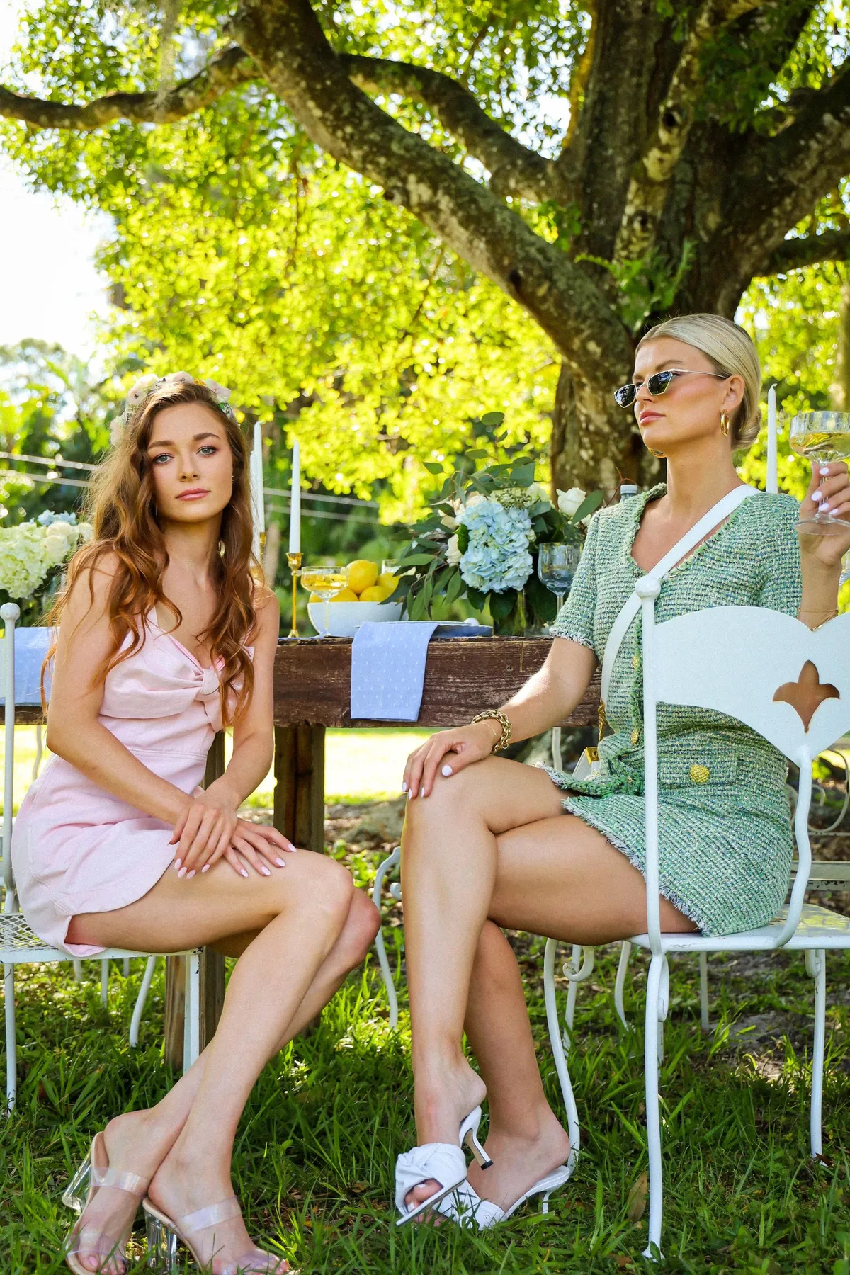

Shopping note: This journal carries advertisements and may earn a commission from qualifying purchases through marked commercial links. Product availability, prices and returns depend on your retailer and region. Read our disclosure.
A bright colour can act as a small accent or occupy much of an outfit. Compare those two roles with pieces you already have before deciding which relationship you prefer. The exercise is about the visible area of colour, rather than finding an exact shade that supposedly suits everyone. A yellow top with quieter trousers and a yellow combination from top to bottom can communicate very different ideas even when the colour name stays the same.
Choose one colour relationship
Begin with a bright piece you actually own and the supporting clothes you intend to wear. Name the first version plainly: the colour appears in the top, in a small accessory or across several garments. This gives you a specific arrangement to compare instead of a vague ambition to wear more colour.
Avoid assembling a complete new wardrobe for the exercise. If you do not own a larger-area version, you can recognise that limit rather than treating it as a shopping task. The comparison should clarify a preference, not manufacture a missing purchase.
Keep the other elements steady
When possible, change one part of the outfit while retaining the same shoes and bag. Notice how that changes the colour’s prominence. Replacing every element at once makes it harder to see whether your preference concerns the amount of bright colour or something else entirely.
Look at the whole outfit from a useful ordinary view. A close photograph may make the bright fabric fill the frame even when it occupies a small part of the actual combination. Judge the relationship you would wear rather than a crop that exaggerates it.
Compare supporting contrast
A quiet supporting piece can make a bright area more distinct, while a second vivid colour can create a different relationship. Neither approach needs a universal rule. Ask whether you can identify the balance you wanted and whether the complete outfit feels like a choice you would actually make.
The colourful autumn outfit guide offers wider combination ideas. Keep this particular comparison focused on area and contrast instead of turning it into a search for a new colour formula on every occasion.
Record a wearable version
Choose the version that has a real role in your wardrobe and note the actual pieces together. A private reference photograph can help, provided it shows enough of the outfit to preserve the proportion of colour. Name any supporting layer that changes the effect when added.
The weekly outfit guide helps connect a visual idea to ordinary use. You can prefer a small bright accent on one day and a larger area on another. The useful decision is not that one amount of colour is correct; it is that you understand the relationship you chose and can recreate it from clothes already available.
Have a correction or a question? Contact the journal. See how we choose topics and approach shopping advice.